
Estimated reading time: 8 minutes
Peripheral vision is optimized to detect movement and large shapes. For example, in the above image, a person looking at the green field is likely to note an odd, large shape in the periphery but not any of its details. In order to resolve detail, the person’s center of gaze must shift towards the shape to fully appreciate the quaint barn with the peeling red paint. In other words, the barn needs to fall on the fovea for all the fine detail and color processing to occur. The problem is that the fovea only covers about two degrees of the visual field, about the width of two fingers at arm’s length, so people move their eyes often – with attention selecting a part of a scene in the periphery for processing and then an eye movement following. A critical question in natural scene research is what type of information in the periphery will attract attention.
Low-Level vs. High-Level
Oftentimes, researchers divide what attracts attention in a scene into low-level image features and high-level semantic meaning. Low-level features are basic visual properties that compose a scene such as luminance, line orientation, color, motion, and depth. Some research suggests that low-level spatial discontinuities attract attention. For example, areas high in luminance contrast or with large changes in color grab a person’s attention resulting in an eye movement towards that area. In contrast, high-level semantics refers to the semantic representation of the global scene or its local components such as objects, surfaces, and other meaningful entities. There is research that indicates that semantically meaningful portions of a scene can also attract attention and drive eye movements.
Saliency Map vs. Meaning Map
Much of the existing research on attentional guidance within real-world scenes has focussed on the importance of low-level features. One reason for this is that low-level features are relatively straightforward to extract and manipulate. Christof Koch and Shimon Ullman conceptually captured this idea in the form of a saliency map in 1985. A saliency map highlights areas in a scene that contain salient low-level information such as color changes, edges, etc. Over a decade later, Laurent Itti, Christof Koch, and Ernst Niebur (1998) and Laurent Itti and Christof Koch (2000) implemented popular attention and saliency map models. Below, the barn image is on the left, and its saliency map (based on the former model) is on the right. The right image shows the model’s predictions for the farm scene based on color, orientation, and intensity discontinuities. Specifically, the reds and yellows highlight the areas the model predicts would attract attention and consequently an eye movement.
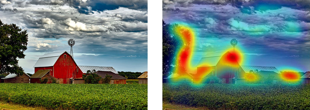
In contrast, a scene’s semantic informativeness is difficult to conceptualize let alone quantify. Over three decades after the introduction of saliency maps, John Henderson and Taylor Hayes (2017) introduced a novel technique for creating meaning maps. Meaning maps capture the distribution of semantic factors across a natural scene – in the same heatmap format as the saliency maps to allow comparison. In addition, they showed that meaning maps as compared to saliency maps could better predict the distribution of people’s attention in scenes. Recently, the two authors along with lead author Candace Peacock took this result one step further. They asked whether semantic dominance would hold even if meaning information was completely irrelevant to the task at hand.
Creating Saliency and Meaning Maps
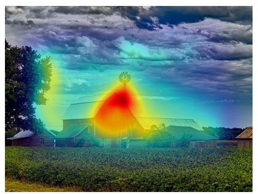
To test whether meaning would drive attention in tasks that required only low-level luminance information, Peacock, Hayes, and Henderson (2019) derived saliency and meaning map predictions for 40 images. For the saliency map predictions, they used a well-known, biologically plausible visual salience model, Graph-Based Visual Saliency (GBVS) by Jonathan Harel, Christof Koch, and Pietro Perona. Below is its prediction for the farm image.
For the meaning maps, Peacock, Hayes, and Henderson segmented each image in overlapping circles at two scales:
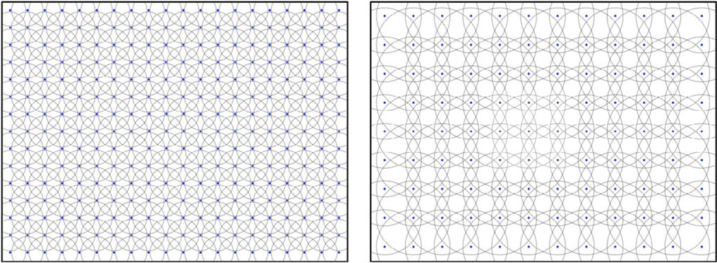
They then cropped those patches from each image. Examples are below for both scales. Just by eyeballing, it is quite clear that some of these patches have more semantic content than others.
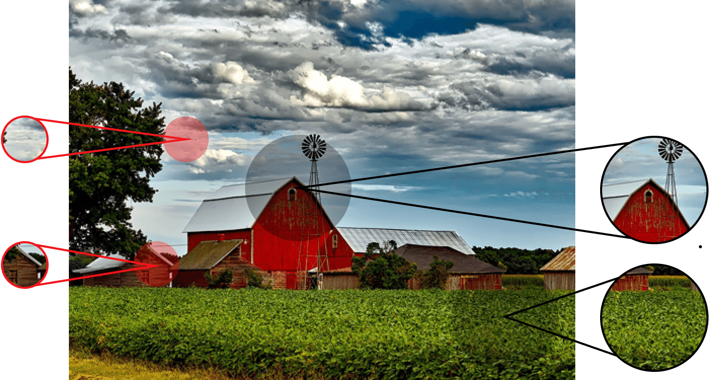
One hundred and sixty-five people then rated 300 random patches on meaningfulness on a six-point scale from very low to very high. Finally, the experimenters created meaning maps by averaging, smoothing, and interpolating the ratings for each image. The end results were meaning and saliency maps with pixel-by-pixel predictions for which areas would draw attention. These predictions were then compared with reality – people’s actual attention distribution for the same images represented in the classic heatmap format, which showed people’s fixation locations and durations across the image.
Creating Attention Maps: Eye-Tracking
Specifically, Peacock, Hayes, and Henderson needed to determine where people attended; to this end, they tracked where people looked. An underlying assumption in this research area is that attention is highly tied to eye fixations. Consequently, they examined fixations across the scene to measure the distribution of attention (i.e., distribution of fixations = distribution of attention).
For the experiment, they had a new group of people examine the above-rated images while an EyeLink 1000 Plus tower mount tracked their eye movements. Each person viewed 20 images for a brightness rating task and the other 20 for a brightness search task. Neither task required any semantic information to complete:
- Brightness Rating – Participants rated the overall brightness of the scene on a six point scale from very dark to very bright.
- Brightness Search – Participants counted the number of bright patches in the scene.
The experimenters then generated attention maps from the eye movement data to show where attention was directed. Thus, the saliency, meaning, and attention maps all had the same format enabling comparison.
The results from both tasks supported earlier research from this group in showing that high-level meaning maps, as opposed to low-level saliency maps, match up better with the distribution of attention across scenes – even when the task was to pay attention to low-level features!
Conclusions
Given the limits of the visual system, humans must prioritize scene regions for attention. The results from Peacock, Hayes, and Henderson’s experiment show that even in tasks for which meaning is completely and utterly irrelevant, people prioritize meaningful over salient scene regions for attention. People can’t help but pay attention to scene meaning.
This result plays an important part in a larger body of work shifting focus to the importance of high-level scene content on attention. With the introduction of meaning maps and the idea of quantifying semantic content in a scene region, new and old ideas can be confirmed, rejected, and further explored.
Contact
If you would like us to feature your EyeLink research, have ideas for posts, or have any questions about our hardware and software, please contact us. We are always happy to help. You can call us (+1-613-271-8686) or click the button below to email:
